

How the Italian heritage inspires Errecom packaging’s design.
Since the beginning of its adventure, Errecom has turned the packaging into a distinctive feature, taking care of it with the same attention and dedication reserved for the chemical formulations of its products. For example, Errecom came up with the idea of inserting the cartridge into blisters at 45°, a design that is now well known in the sector as it has been copied by competitors all over the world.
For its twentieth anniversary, Errecom is restyling the cardboard boxes and displays. The company logo stands out clearly on the black background, while the clean and minimalist design expresses the communicative role of the packaging. The company’s focus on the environment remains essential: the cardboard used is made from recycled material.
Despite the international approach, the company has never lost the peculiarities that made it a proud example of the Made in Italy label around the world.
Aesthetic taste and harmonious style: the Italian design, in fact, earned a remarkable place in international markets, making the Made in Italy label an unquestionable symbol of beauty, a proud representation of the aesthetic vision that naturally belongs to Italian minds and feeds their creativity and talent.
Thus, Errecom’s creative process never stops and keeps shining, to offer the market not only innovative chemical solutions but also products that are highly recognisable thanks to their appealing and modern packaging.
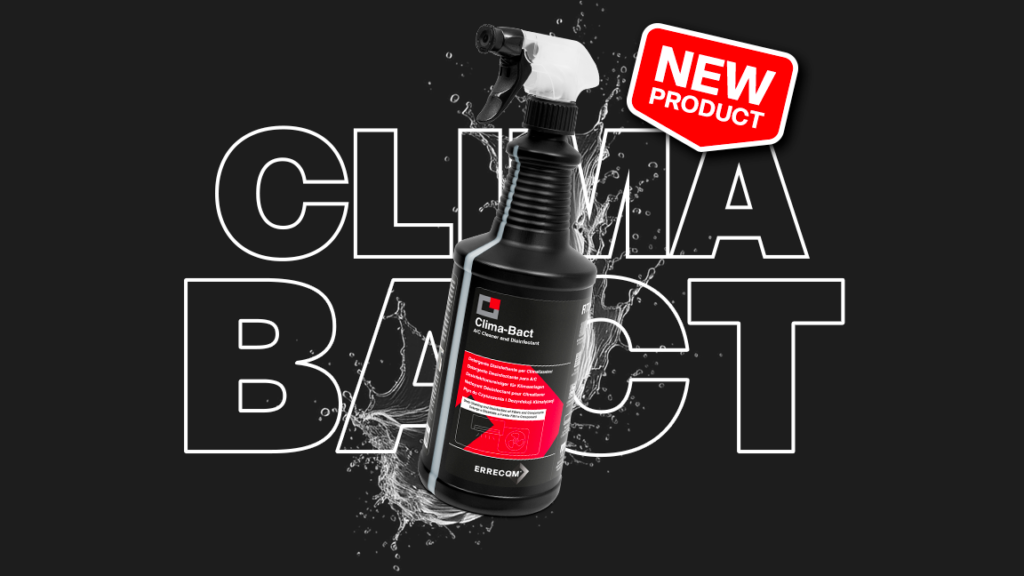
Just think of the new total black bottles of refrigeration lubricants, soon available all over the world. Black was chosen in this project too, as the colour representing a timeless style, to communicate the refined aesthetic taste to which the company aspires.
At Errecom everything is studied in detail.
Innovative ideas meet the typically Italian creative way of communicating, demonstrating that it is not only in the fashion or food sectors that the Italian style can be applied but also in less traditional ones such as chemistry.
Inform, amaze, make recognisable. Errecom’s packaging is the pure expression of a company philosophy that not only does it meet the market’s needs with innovative formulations, but which also wants to appeal to the emotions, through exclusive colours and styles.
Uniqueness: this is how Errecom distinguishes its products from the competitors’ ones in the more than 130 countries in which it sells. This is the essential element of an international strategy that has translated a cultural characteristic into one of the company’s strengths.